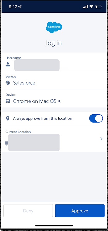
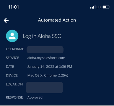
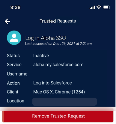
The Salesforce Authenticator app is unusual: it can automate login and verification requests on a user's behalf. That's powerful, but it also means an action happens in the background, and users were often left unsure why an automation succeeded or, worse, why it failed.
I redesigned the language and signals around automation across the app, so that every automated decision is legible: users can see what was approved, on what basis, and what to do when something doesn't go through.
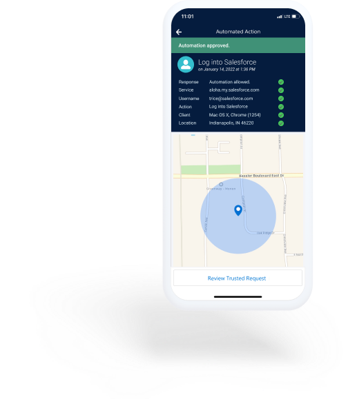
Automations were a hot topic in the app's reviews, and the sentiment wasn't kind. A better explanation of how automation works throughout the experience meant more users could confidently automate their trusted requests, and more of those automations actually succeeded.
Every automated decision in the app rests on five factors. But the app referred to them inconsistently from screen to screen, most painfully around location. Users couldn't understand why an automation failed even when they were standing in a place they'd marked as trusted, because "Location Services" meant something different from what they expected.
The fix started with language: one consistent vocabulary for the five factors, used everywhere.
Einstein Automation evaluated login requests on its own and returned a verdict: approved, or denied. Fast, but opaque. People couldn't see why the decision happened, which signals it weighed, whether to trust it, or what they could do about it. The real problem was never a single screen. It was this: how do you help someone trust an autonomous security system that is deciding on their behalf?
Can the user understand why?
Before anything is approved, every signal the system is weighing is in plain sight.
Who is asking, for what service, on which device, from where. The decision stops being a black box the moment its inputs are something you can actually see.

After it acts, the full reasoning is legible, not just the verdict.
The signals it considered, the outcome it reached, and the place it happened, rendered together so a person can reconstruct the decision instead of guessing at it.

And the decision stays reversible.
What the system has been trusted to do can be reviewed and revoked the moment it stops feeling right. Confidence comes from knowing you can always take the keys back.

Visibility becomes explainability. Explainability becomes confidence. Confidence becomes trust.
Downloaded and lived in the app to document the real automation experience, then mined App Store feedback (where automation was a hot topic with plenty of frustration) and audited the app to pinpoint the pain.
Built a presentation for Identity Org Demo Days that generated strong feedback and real excitement for the improvements, turning a sore spot into a shared priority.
With designs needed in a matter of weeks, I used lightweight guerrilla research to pressure-test terminology and layout quickly without losing rigor.
The app predated SLDS, so I checked every color against the WebAIM contrast checker, partnered with CX to tag text for assistive technology, and set up the next release to support multiple text sizes.